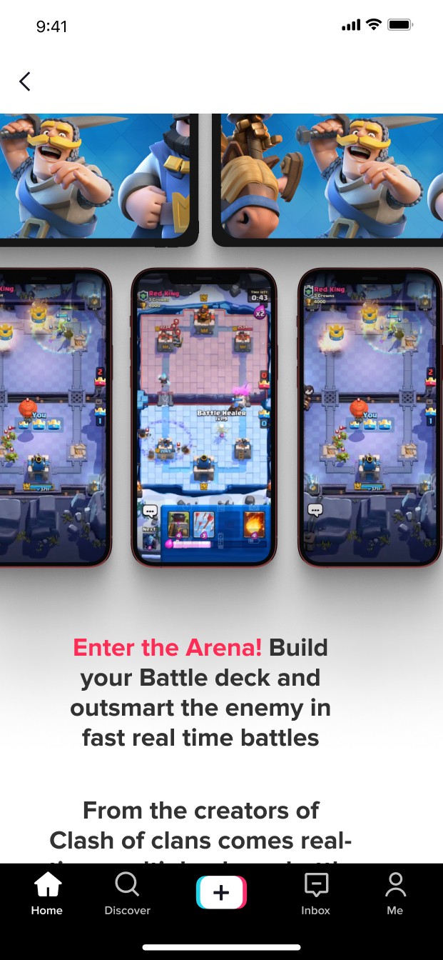
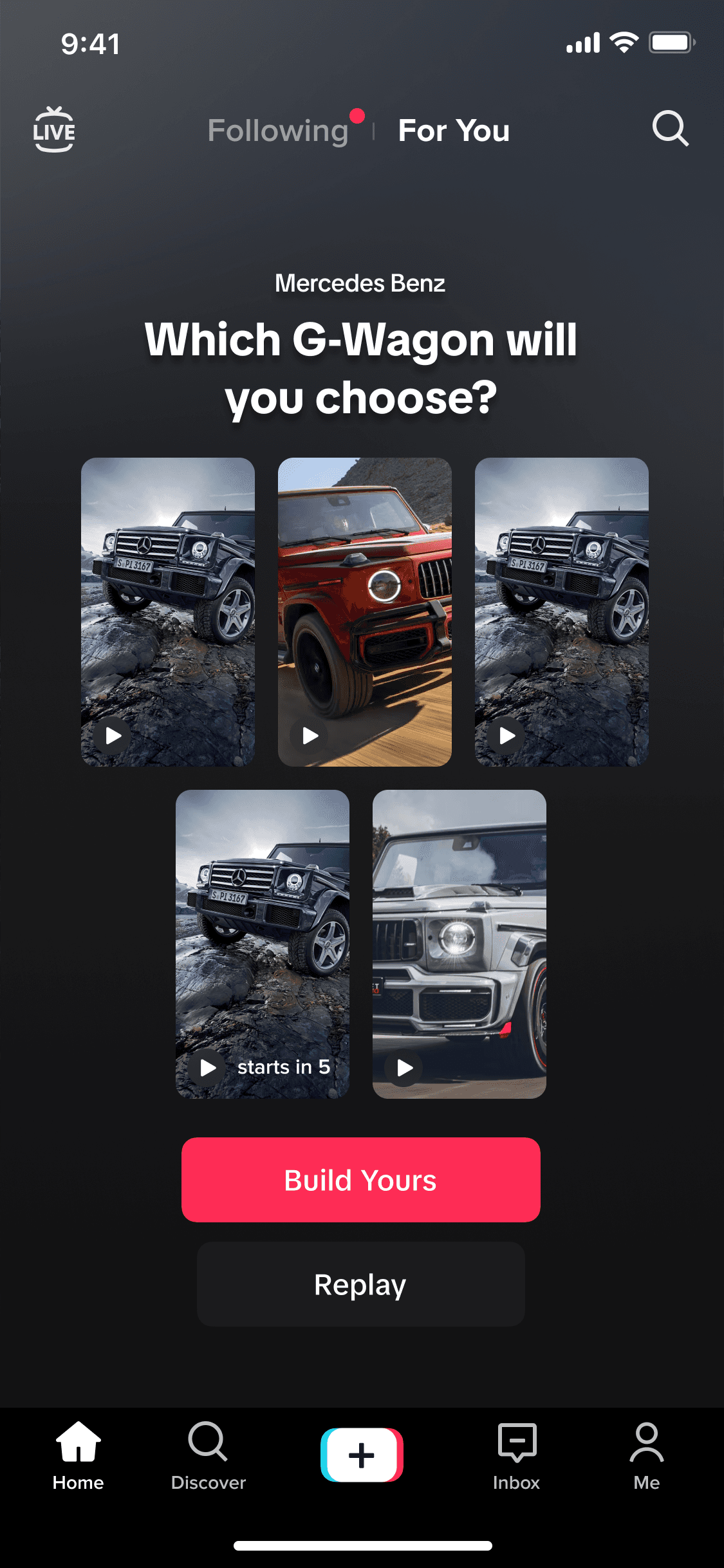
TikTok
At TikTok, I was a staff product designer for the monetization team, creating scalable in-feed and interactive ad formats and drove the 0 to 1 build of Symphony, TikTok’s LLM-powered creative assistant.
About
I spearheaded TikTok's monetization efforts to scale how creators and businesses can advertise on TikTok. This spanned across e-commerce, gaming, apps, lead generation, travel and entertainment categories. My efforts led to refreshing and creating new scalable ad formats within the for you feed, adjacent properties and interactive video experiences.


Problem
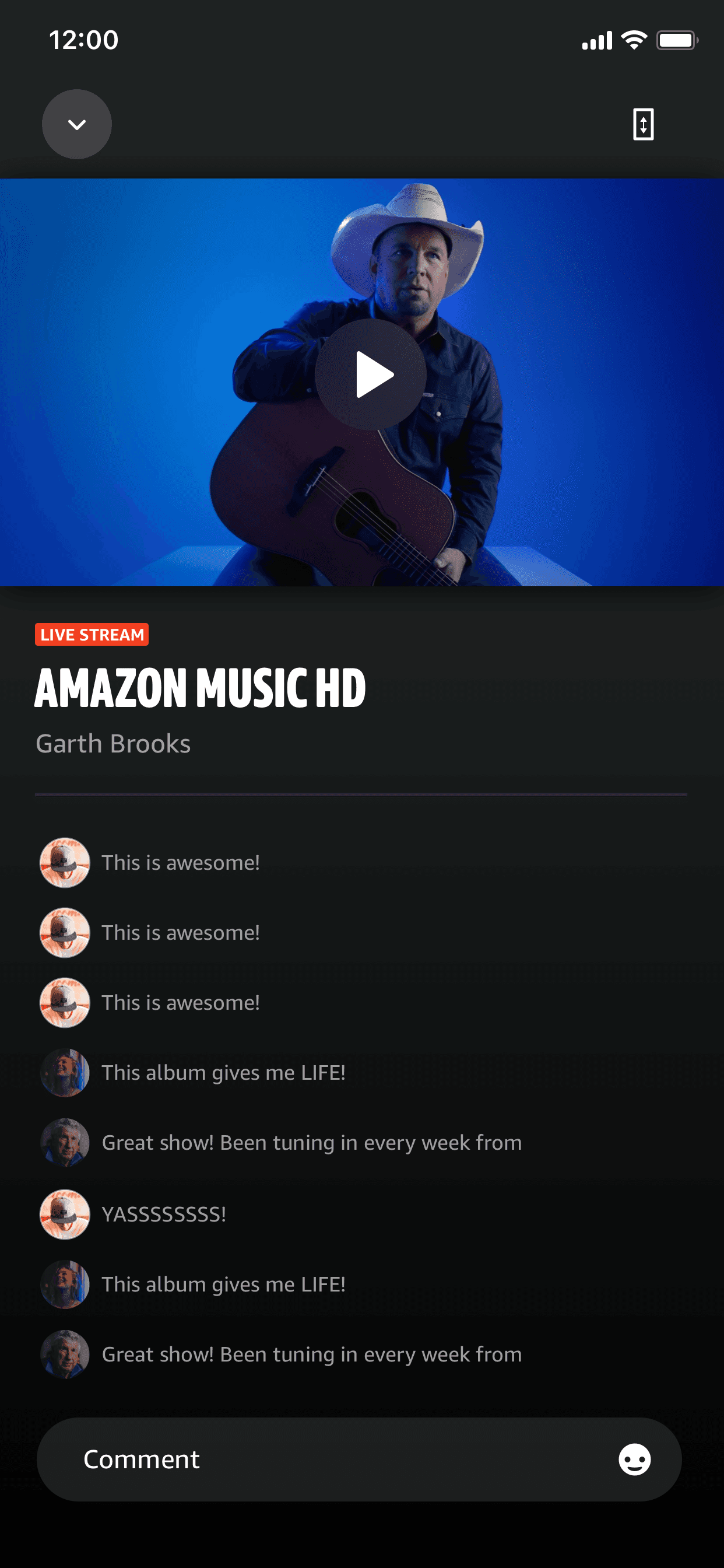
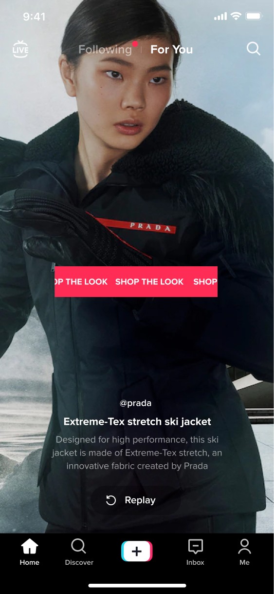
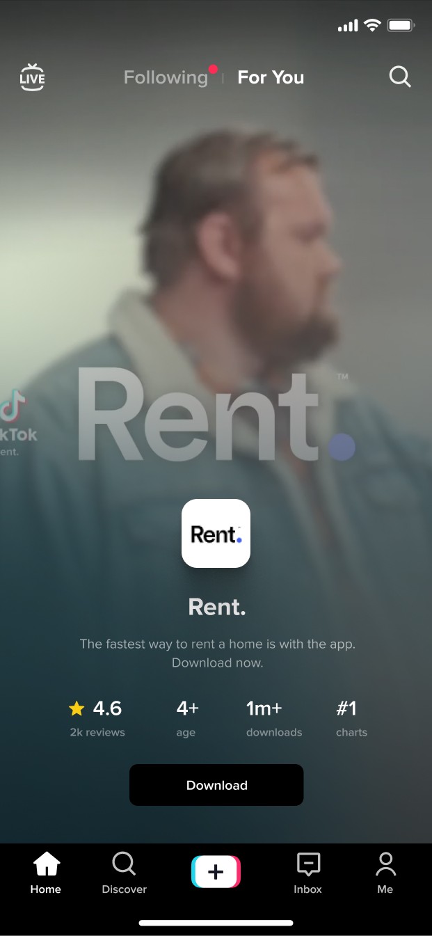
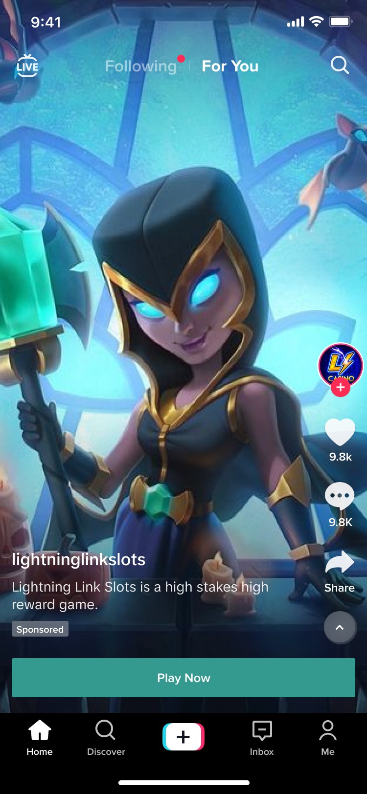
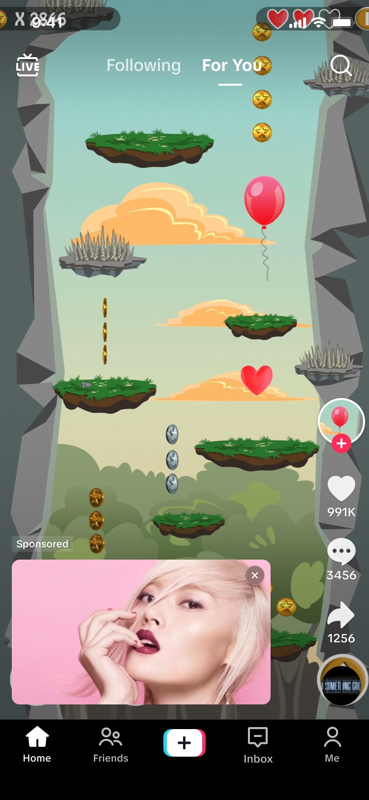
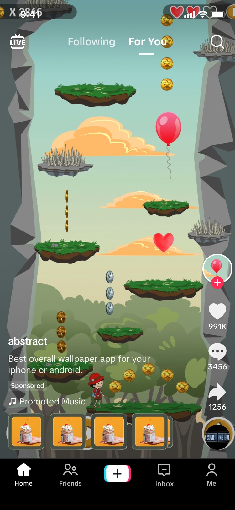
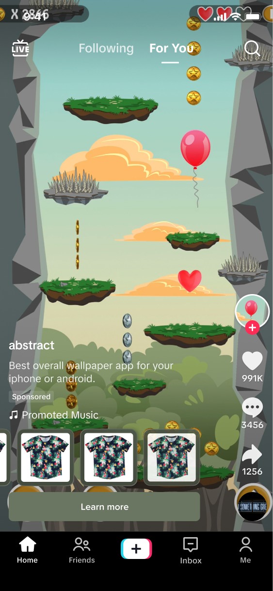
TikTok users often encounter a jarring, confusing and untrustworthy ad experiences. This is largely driven by the visual presentation and interaction design of ad formats in combination with the ad video. The ads frequently suffer from visual clutter and using elements that block the core video content. When formats utilize visuals perceived as low-budget, poorly designed, they immediately signal a scammy intent. This causes users to quickly identify, distrust, and scroll passed ads, harming both the user experience and advertising effectiveness.
This involved creating & organizing brand new ad formats to support various verticals, and directly guiding the product and engineering road map. This involved design advocacy, driving premium quality and conducting multiple test cases.
My Role
Product Design Lead, UX/UI, Stategy, prototyping and UX Motion
Collaborations
Development, Design, Product Management, Research & Leadership
Design Disciplines
Product design, UX/UI, Prototyping, UX Motion, Weekly tracker syncs, Usability Testing, A&B testing
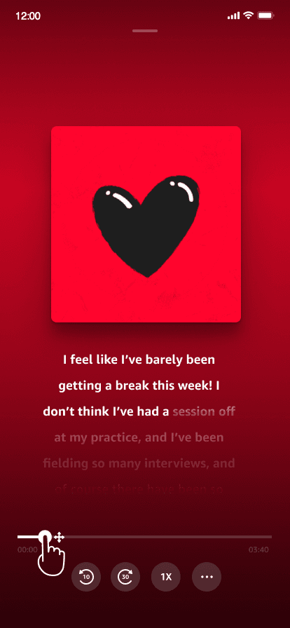
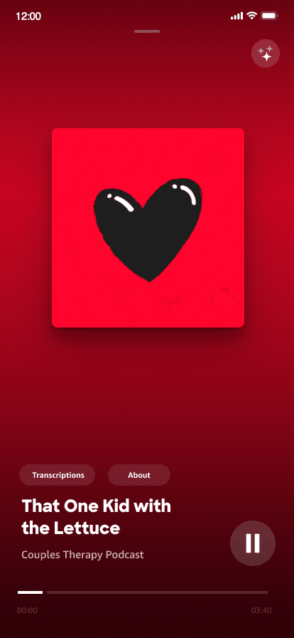
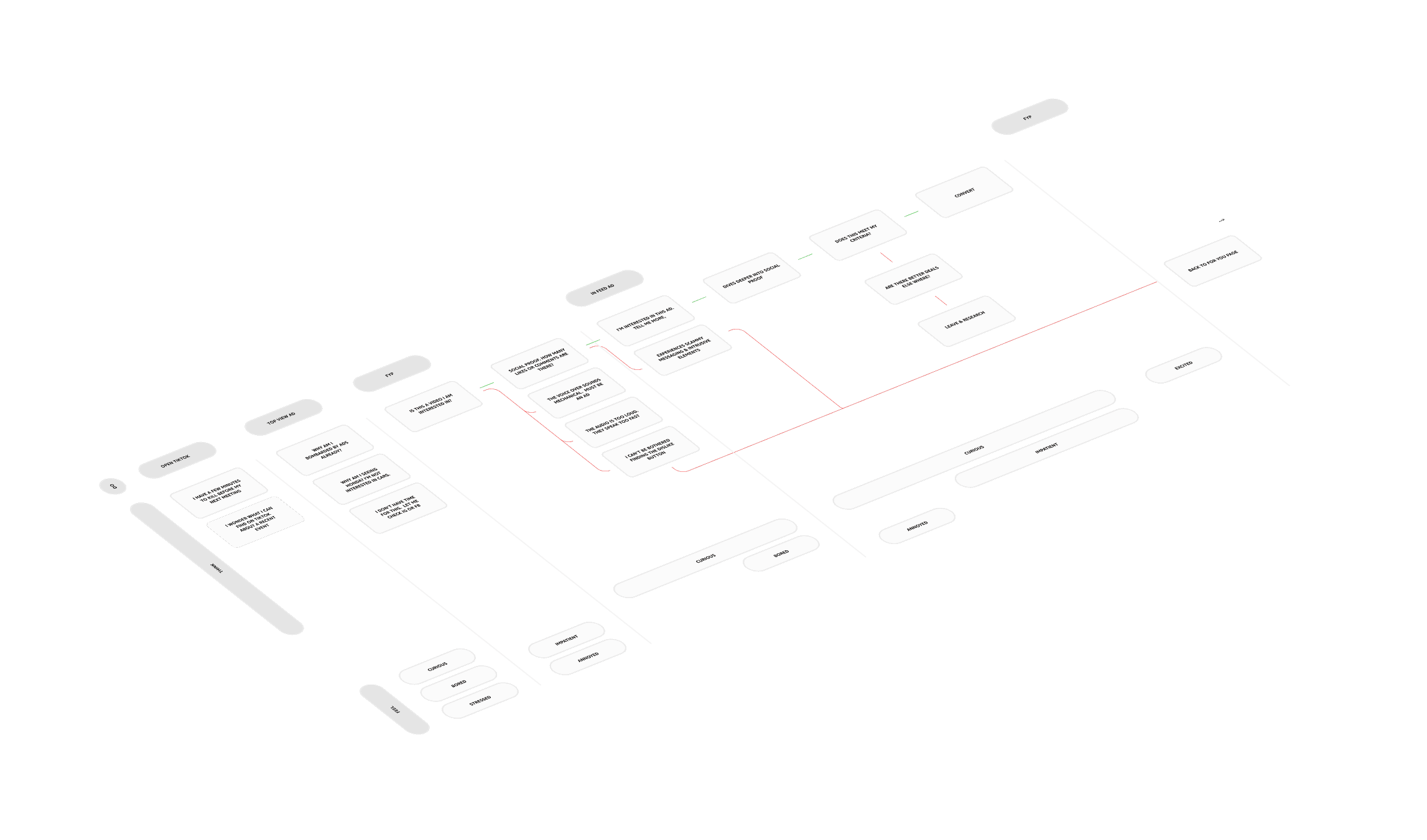
Repetitive
Users were shown the same ad multiple times within a very short period which led to ad fatigue and a negative perception of the brand and the platform.
Pain Point
+
Overwhelming
Ads often contained too much information which increased cognitive load making it difficult for users to convert.
Pain Point
+
Irrelevant
The ads displayed do not align with the user's interests, viewing history, or demographic.
Pain Point
+
Unauthentic
Users prefer authentic, relatable ads that blend naturally with creator content. Many of the ads felt too salesy and lacked polish
Pain Point
+
Intrusive
Ad formats were perceived as intrusive due to the visual weighting & deceptive design tactics.
Pain Point
+
Untrustworthy
Users perceived ads untrustworthy, often because the information felt like a scam and the aesthetic was not minimal, aesthetically pleasing, which users found less credible.
Pain Point
+
Business Problems
Archetypes
14%
The impulse buyer
The impulsive customer is a spontaneous shopper, unlike the researched customer, who frequently buys on a whim based on wants rather than needs. Since these customers are very impatient and dislike long queues, minimizing wait times and reducing the time they have to consider a purchase significantly increases the likelihood of a sale.
Basic CTA
+
Single Product Items
+
Pause Ads
+
Top View Ads
+
8%
The window shopper
Window shoppers love to go shopping for the experiences rather than to purchase specific products. They find the day out shopping as a fun activity rather than a chore. They are usually enticed by high-brow window displays that paint a picture of their future self.
Story Selection
+
Spark Ads
+
Top View Ads
+
21%
The bargain hunter
The bargain hunter is a highly prepared customer driven by promotional sales and discounts, often being the first in line for major events like Black Friday. They conduct extensive research to ensure they receive the best possible deal. Although they buy at a reduced price, they frequently buy in bulk, resulting in a substantial final purchase.
Display Card
+
Single Product Item
+
Multi-Product Showcase
+
32%
The researcher
The researched customer is highly informed, conducting extensive online preparation before shopping. They are focused solely on items on their list and are generally immune to impulse buys. If they find an unplanned item, they will likely defer the purchase to research the best alternatives online rather than buying it immediately.
End Cards
-
Carousel Ads
+
Single Product Item
-
Journey mapping
Principles
Trustworthy
Trustworthy design relies on the honest and accurate representation of information. By providing transparency and delivering reliable outcomes, the interface builds user confidence and encourages sustained engagement.
Principle
+
Relevant
The Relevant principle demands that experiences be tailored specifically to the user's tastes, interests, and current context. By delivering timely and personalized content, the design maximizes value and avoids unnecessary cognitive load or distraction.
Principle
+
Focused
The Focused Experience crafts minimalistic, content-forward interfaces to enhance user delight and reduce distractions. By naturally guiding users, the design ensures a smooth and efficient progression through the conversion funnel.
Principle
+
Consistent
Consistency minimizes cognitive load, enabling users to transfer knowledge quickly and adapt to new situations efficiently. By using predictable design elements and interaction patterns throughout the system, users can focus on their tasks rather than on deciphering the interface.
Principle
+
Human
To capture cues and metaphors from the real world, such as physical laws or natural patterns, to inform the visual direction of the interface. This approach grounds the design in familiar human experience, making the digital environment intuitive and emotionally accessible.
Principle
+
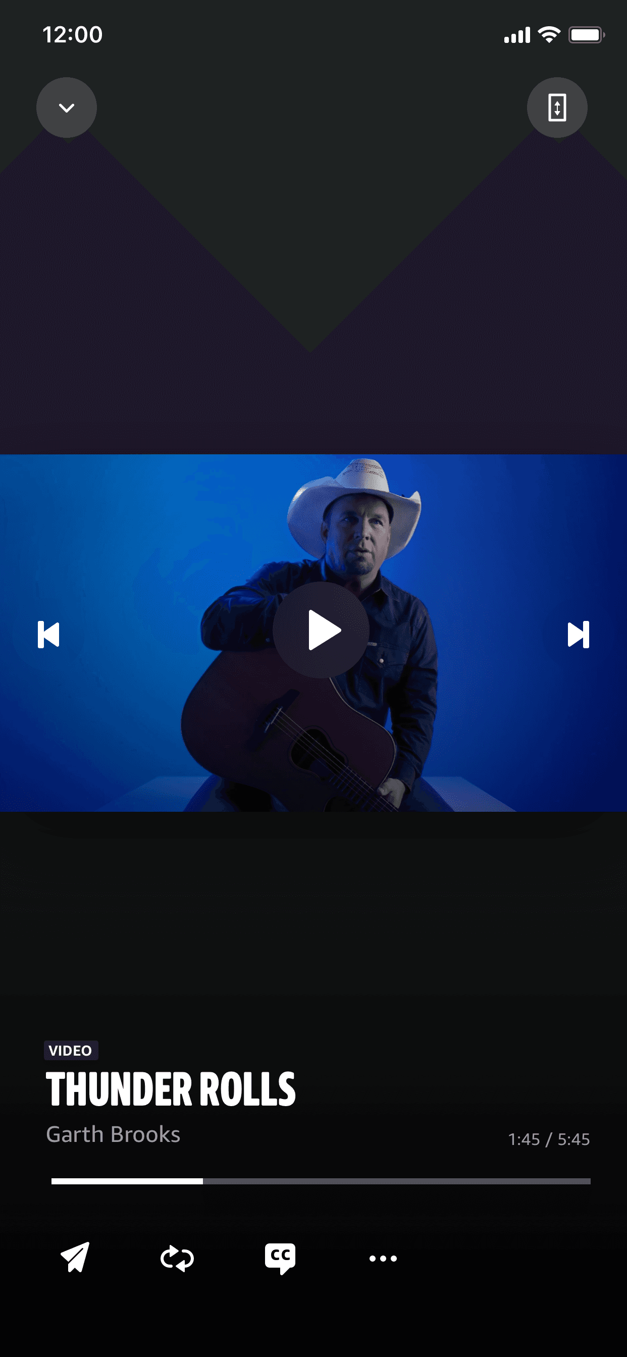
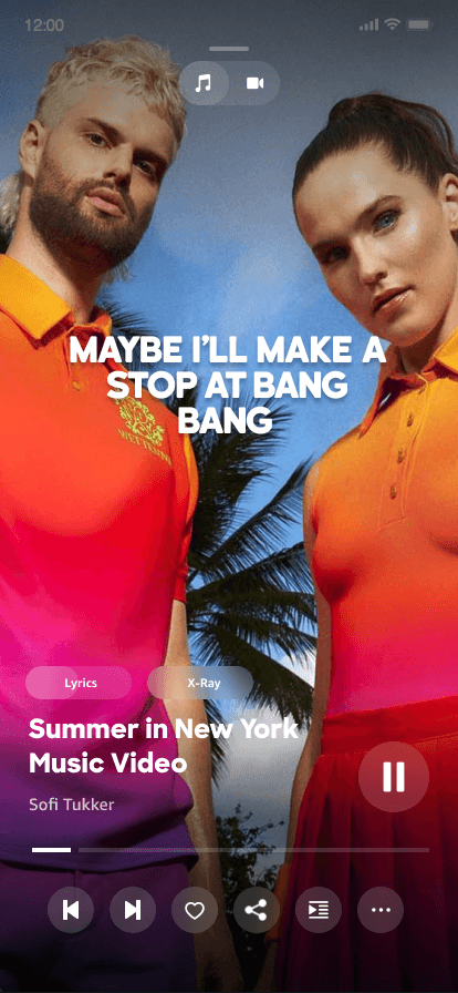
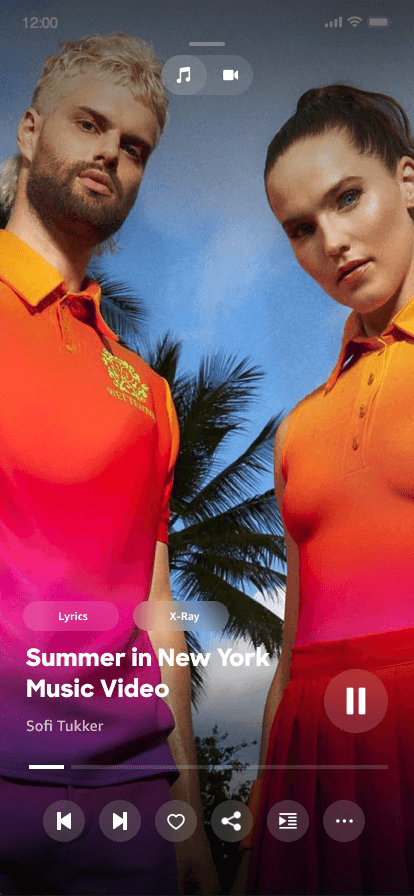
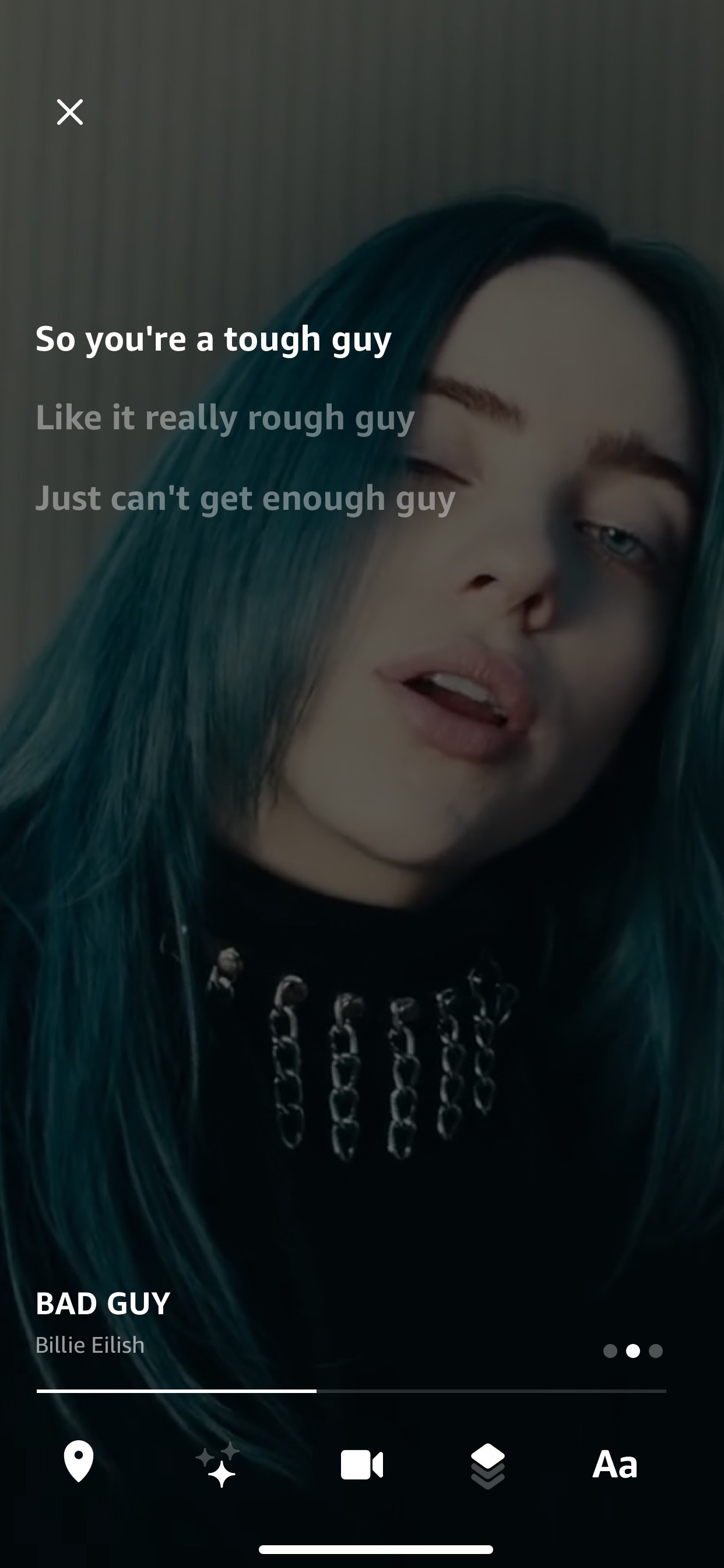
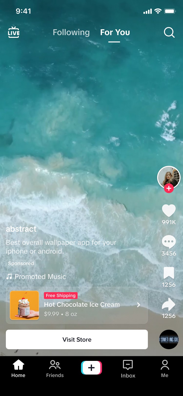
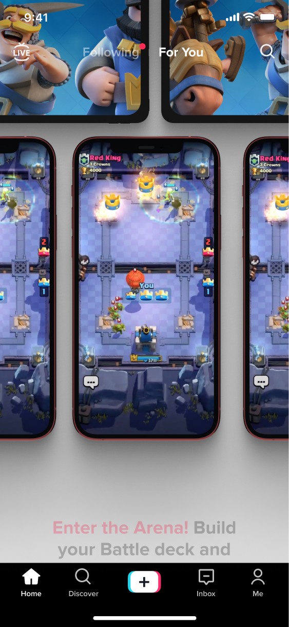
Conversion funnel

Ad formats
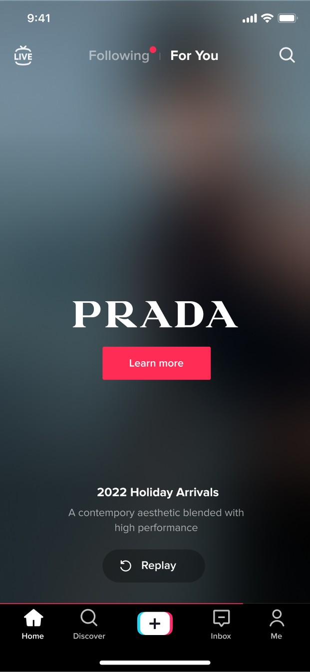
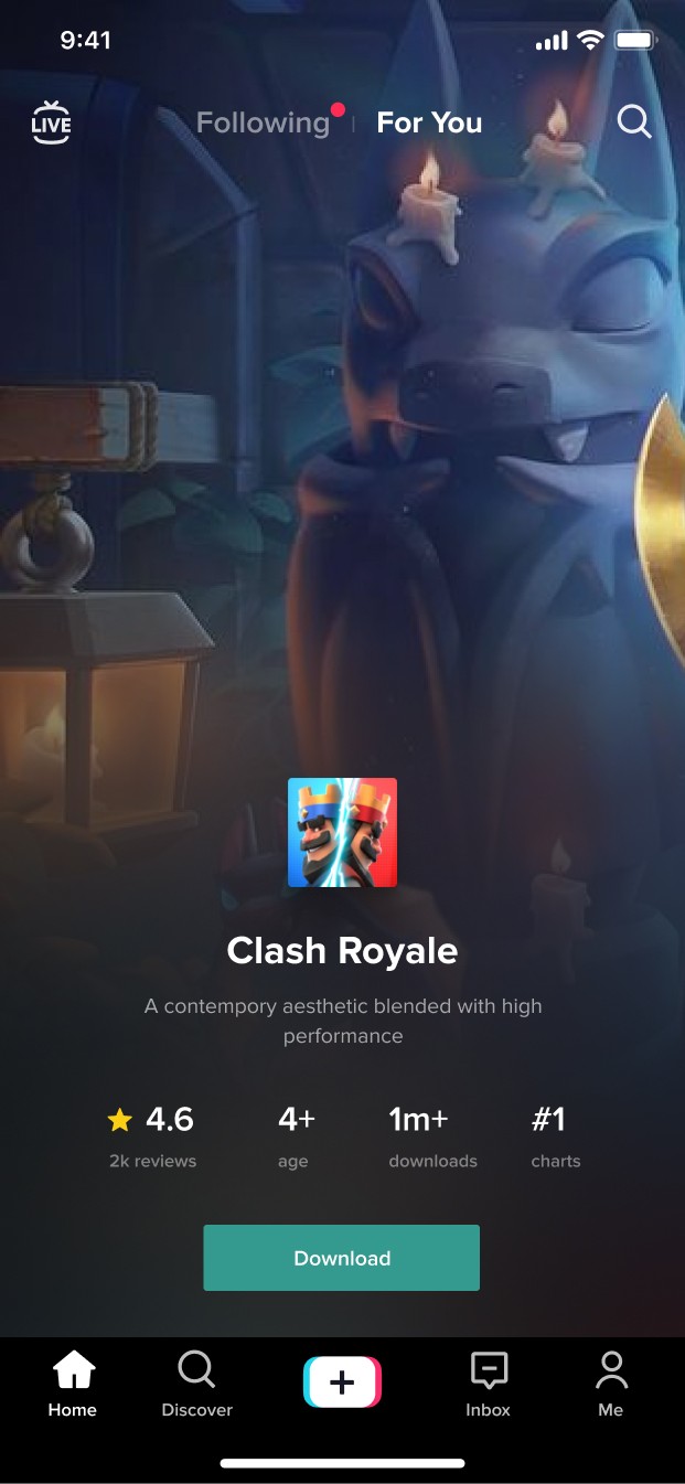
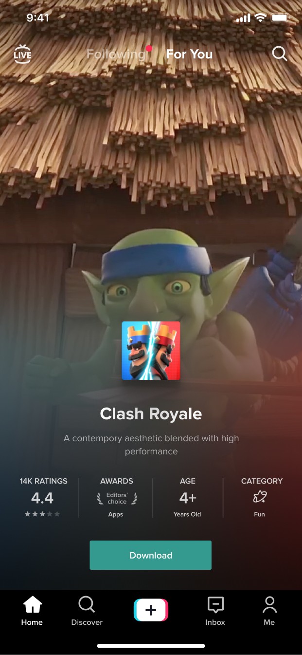
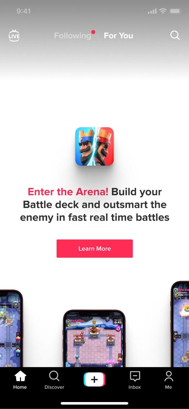
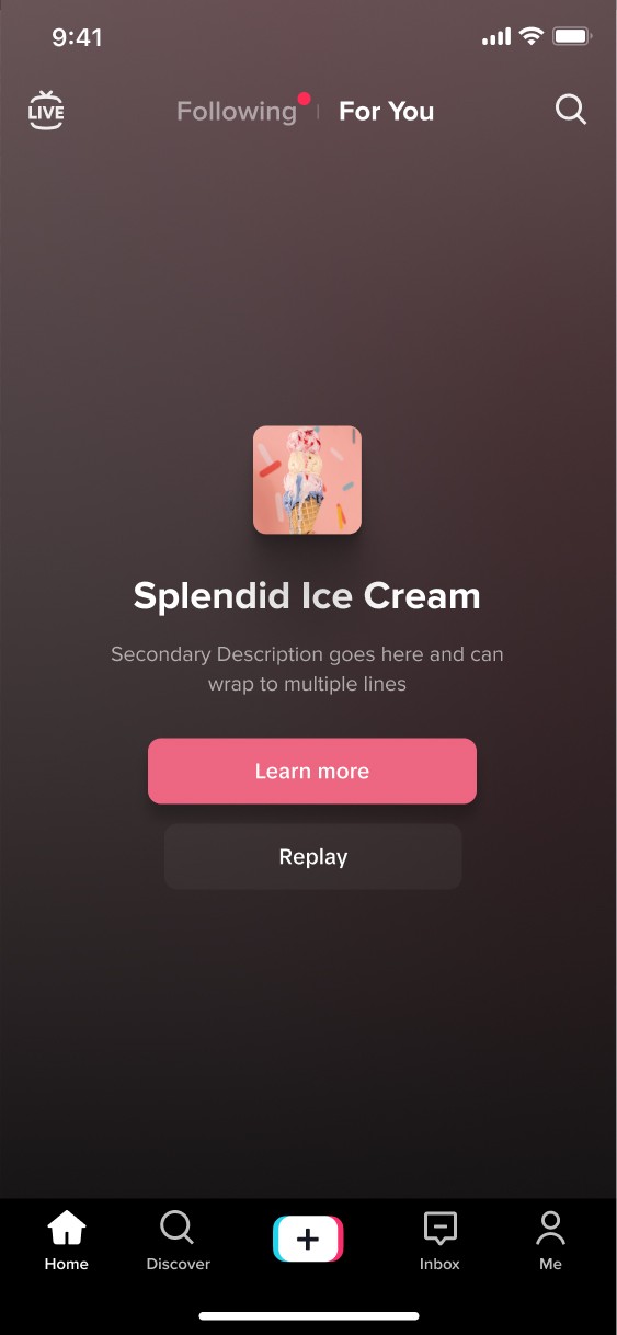
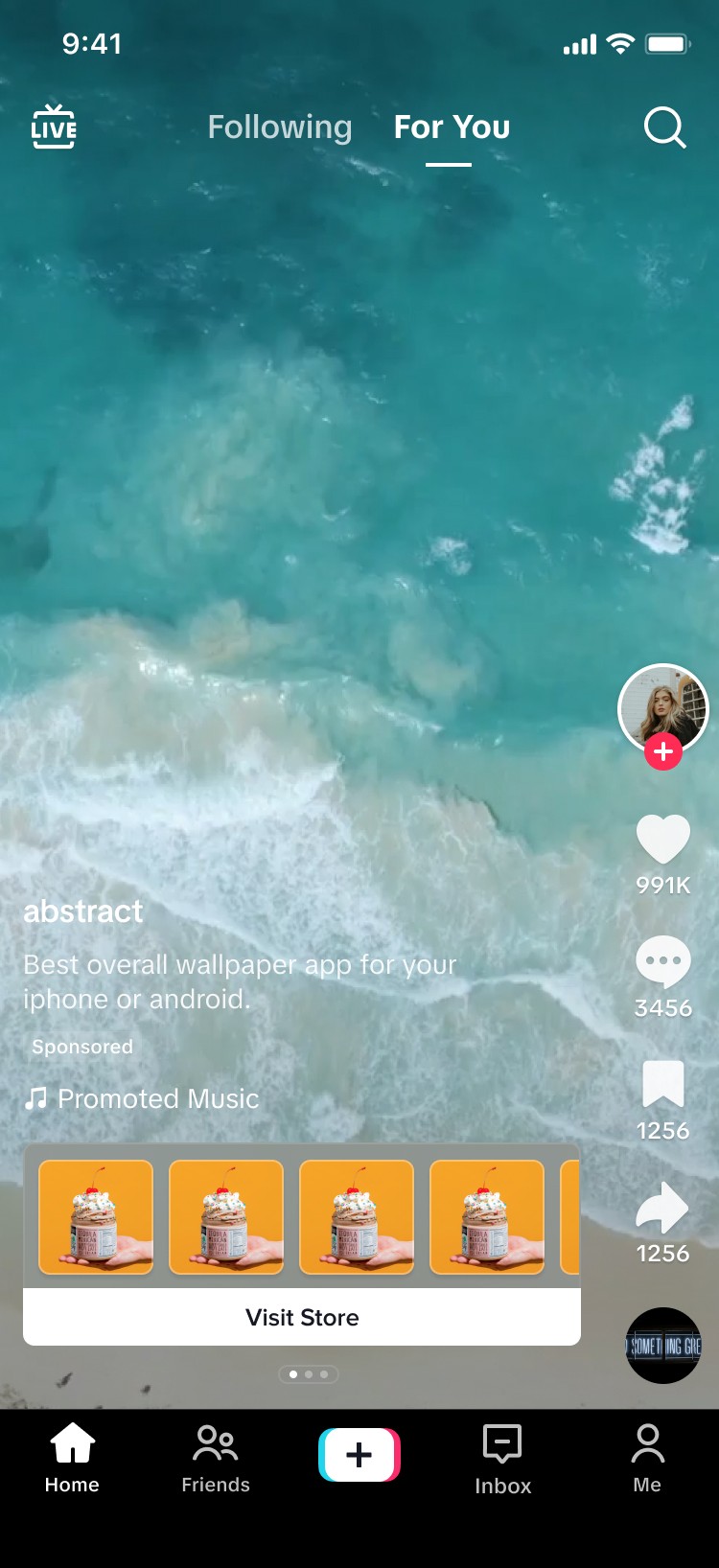
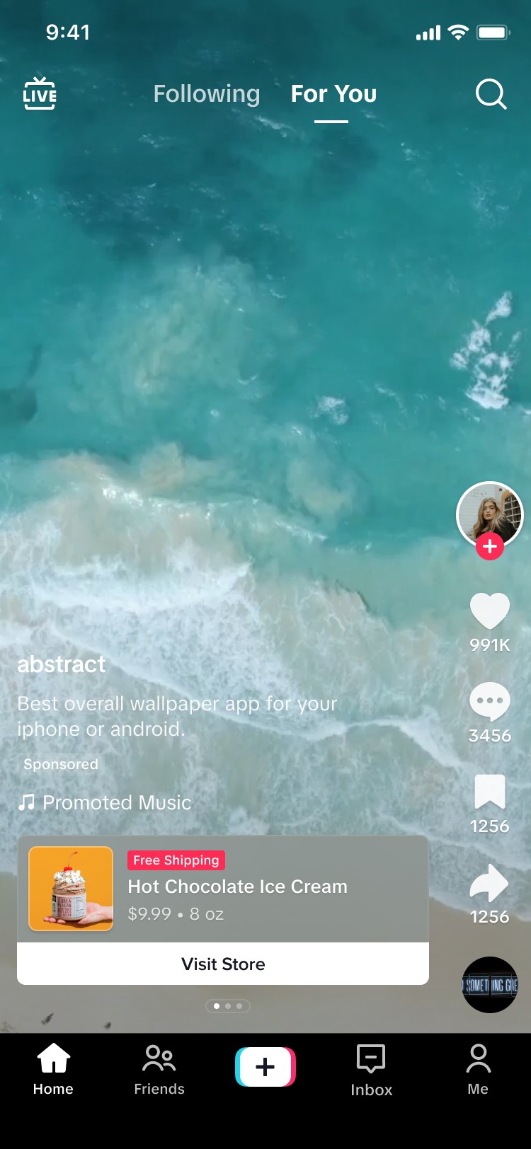
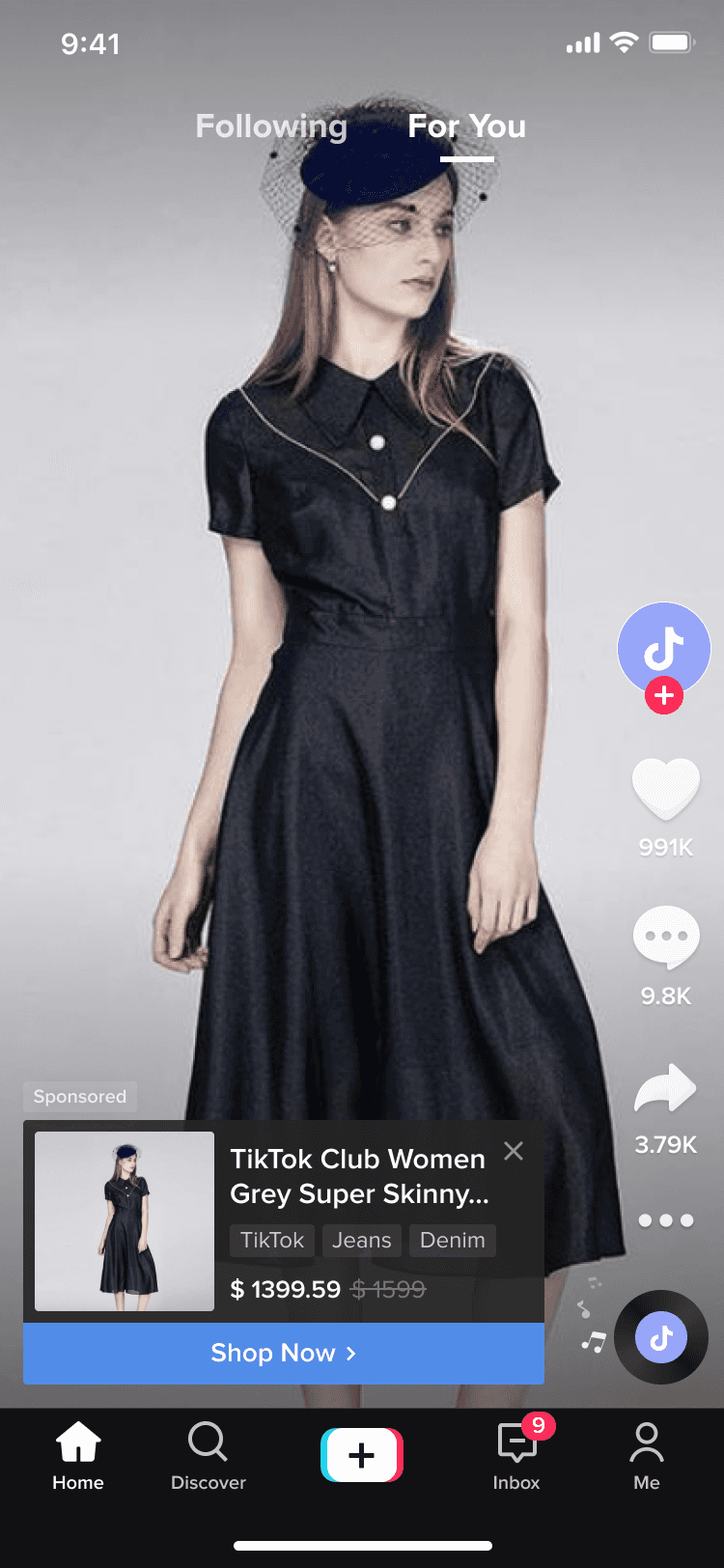
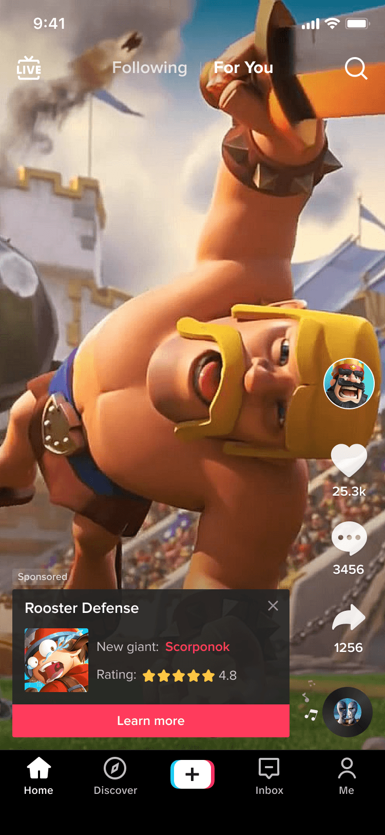
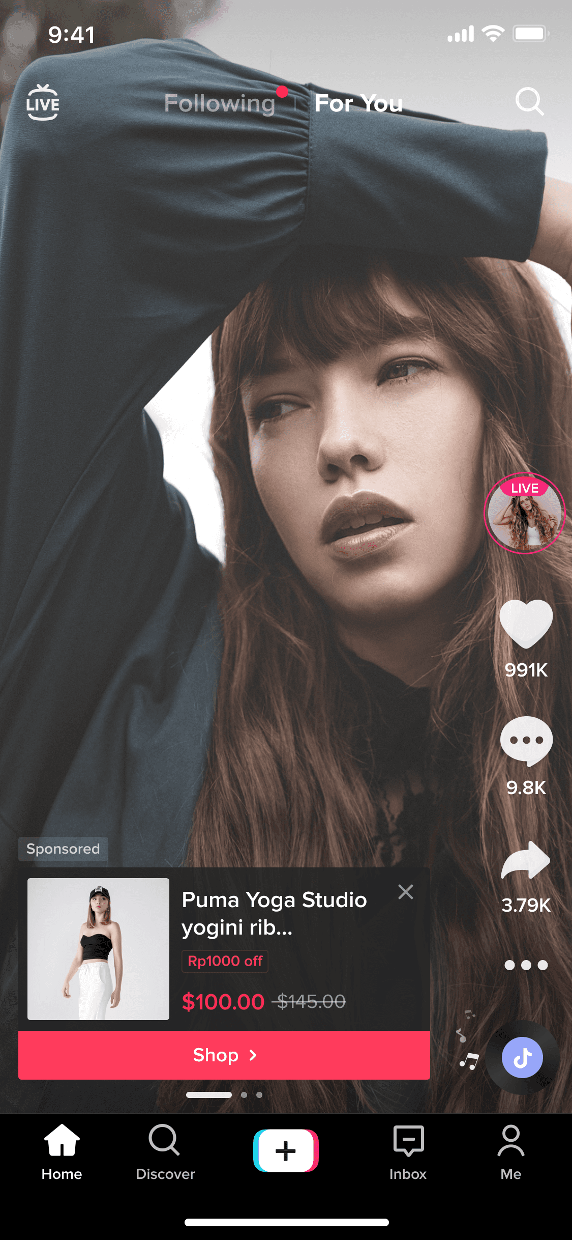
Basic CTA
The basic CTA format contains the default meta data with a call to action.
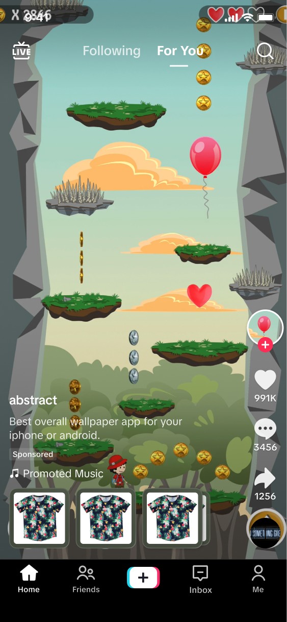
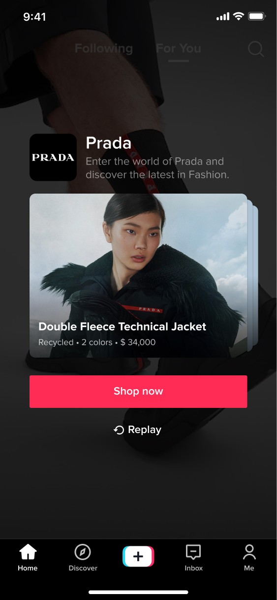
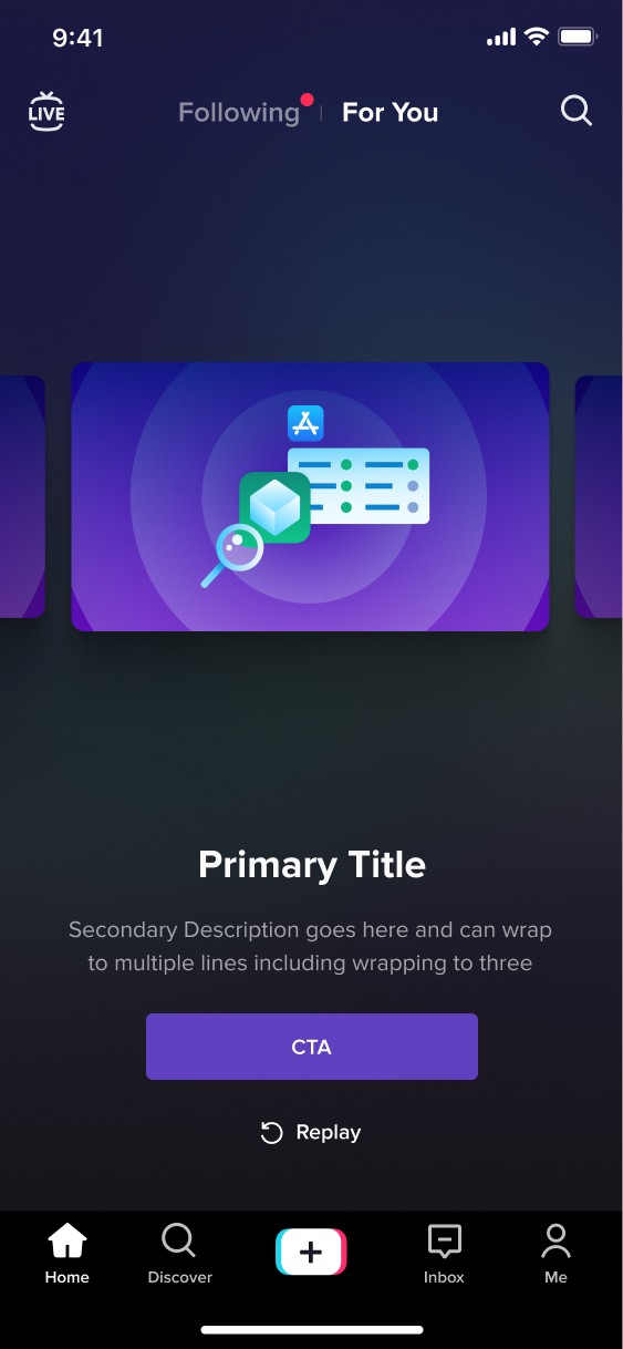
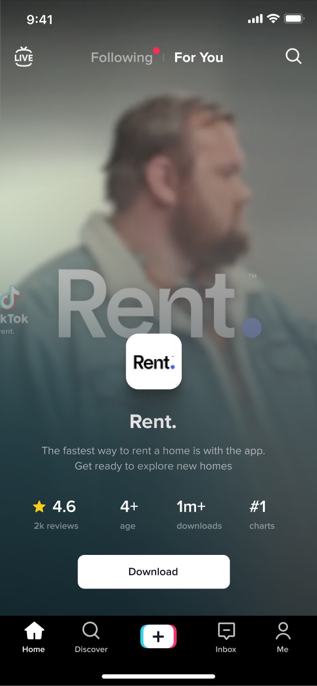
Single Product Item
Single Product format features the ability for the advertiser to be able to promote a single product, app or service.
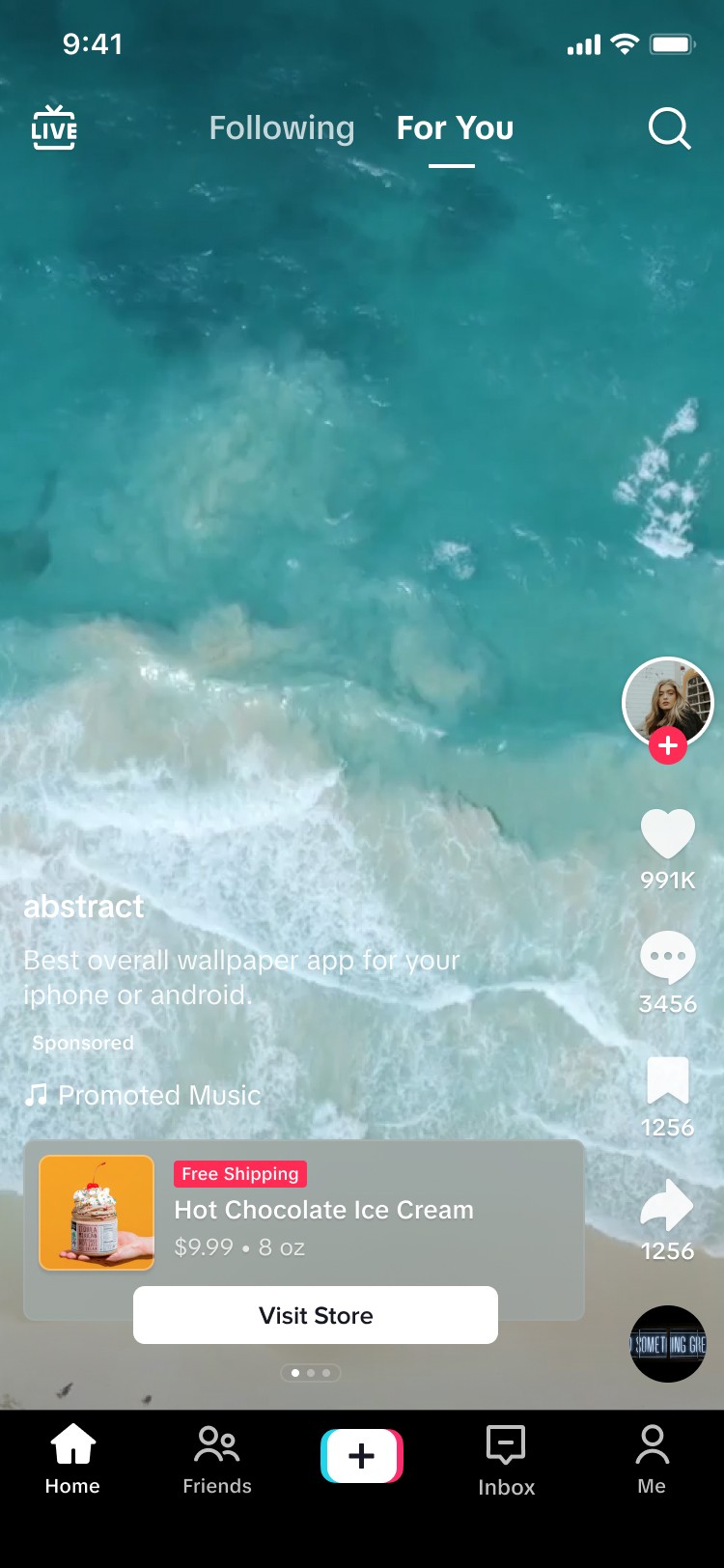
Collection Thumbnail Showcase
This format offers the ability for an advertiser to promote 5 or more products in a thumbnail fashion so that users can quickly see inventory
Collection Multi-Product Showcase
This format offers the advertiser to promote 2 more or products and offer additional product information such as price, name, color and other variables.
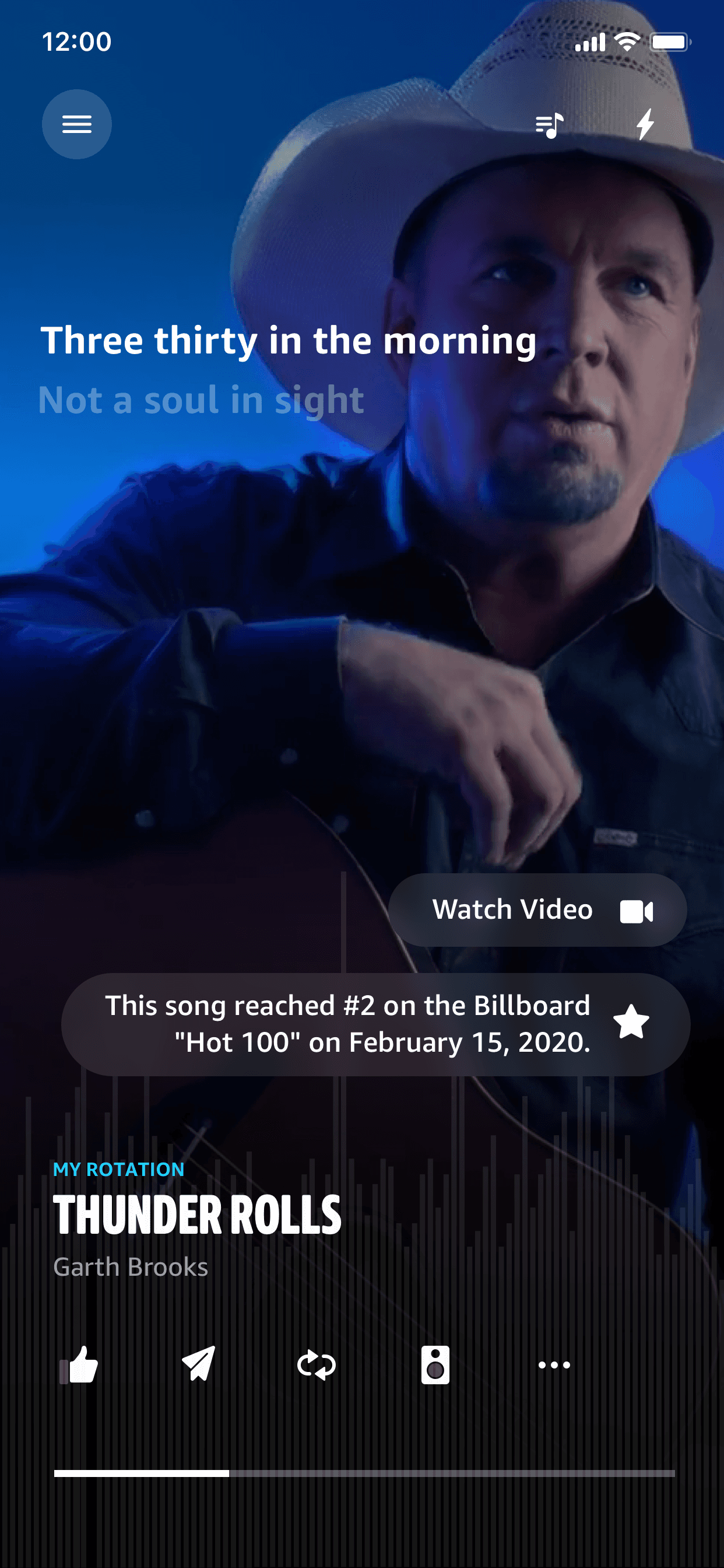
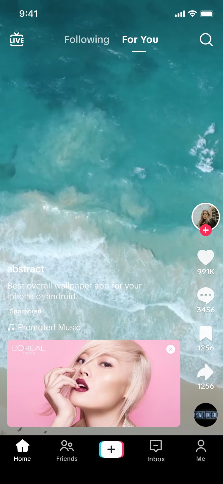
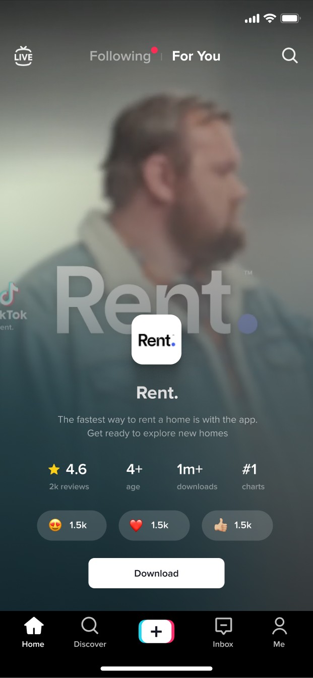
Display Card
Display Card lets you add an additional customized image to your in-feed video ad. Once it appears in the ad, it will function as a CTA button that drives traffic to your website or app download page.
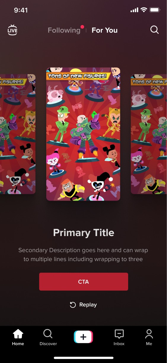
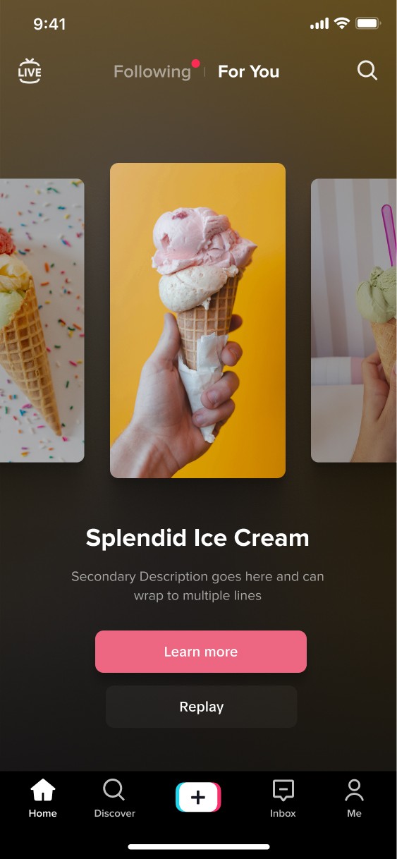
End Cards
Appears at the end of a video. There are carousel end cards and basic end cards. Basic end cards help promote conversion with a basic cta. The carousel format provides information such as screenshots, videos or product images to help improve the consideration and action phases of the conversion funnel.
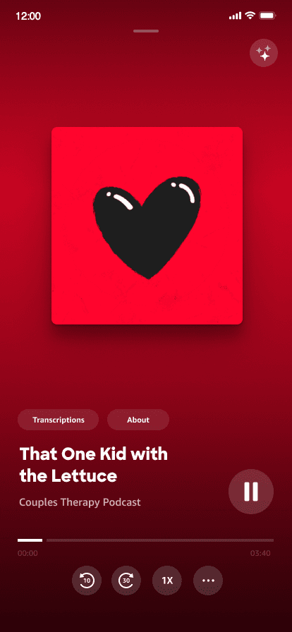
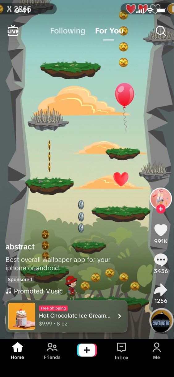
Pause Ads
Pause ads appear while the user has paused the video. These feature app ads & e-com ads.
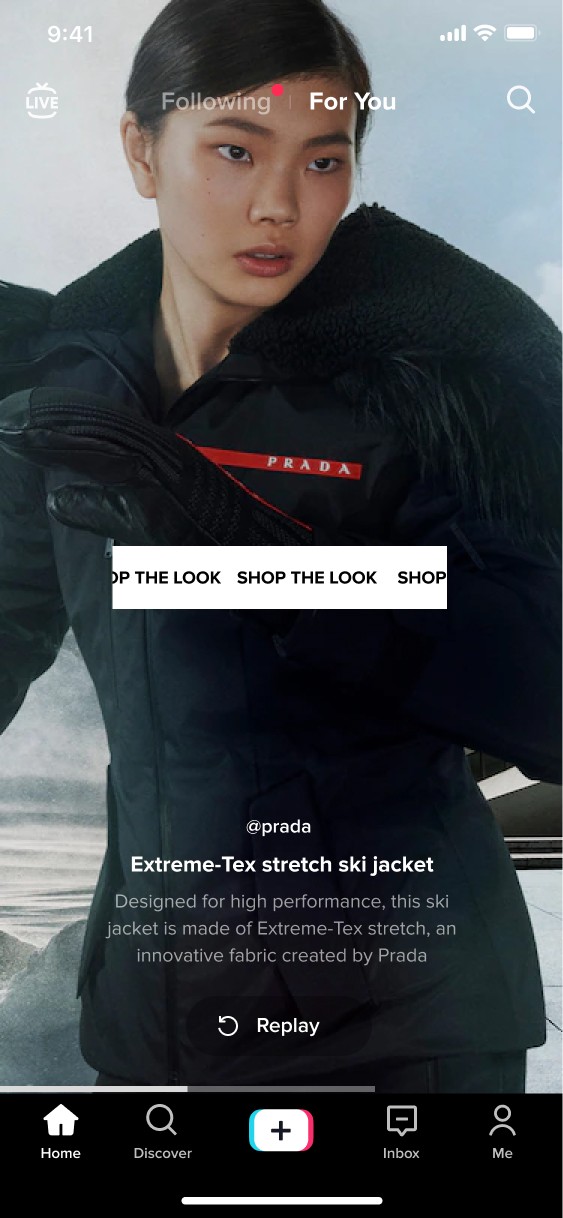
Branded Ads
Branded ads is a term that is used for interactive add ons such as story selection, gift codes, prizes and filters.
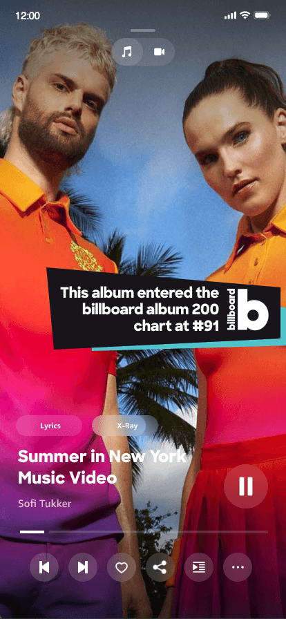
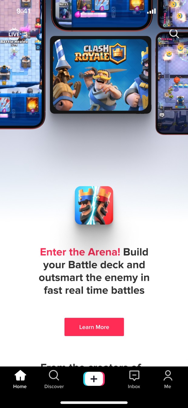
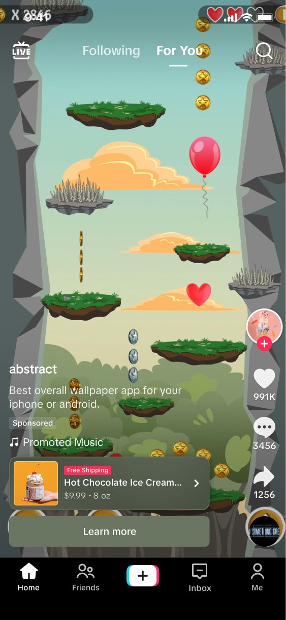
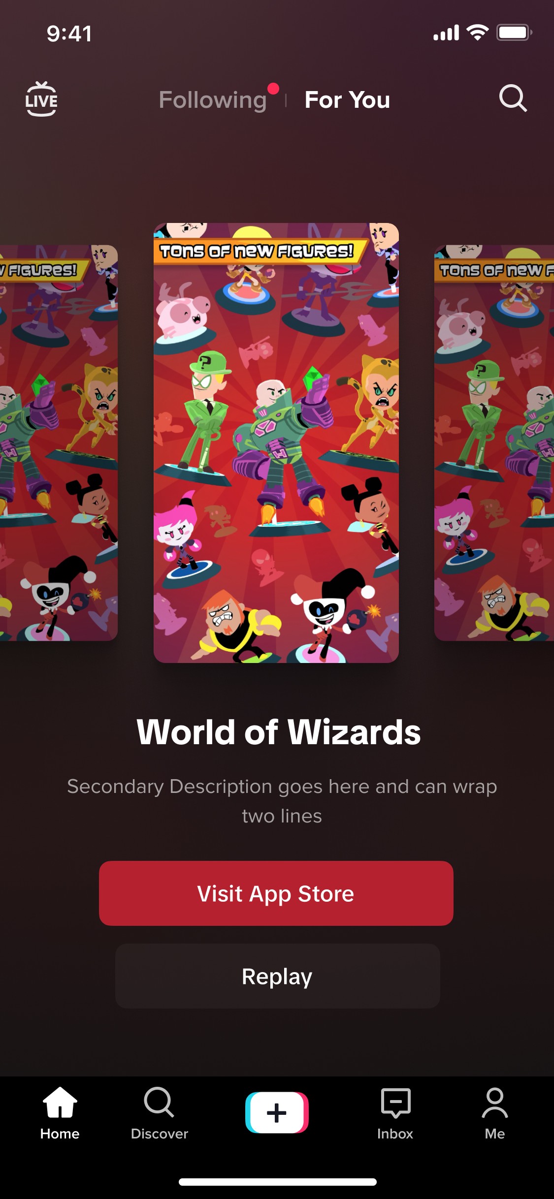
Breakthrough Formats
Design driven formats that are used to elevate the current experience of our formats and look for new innovative ways to show ads.
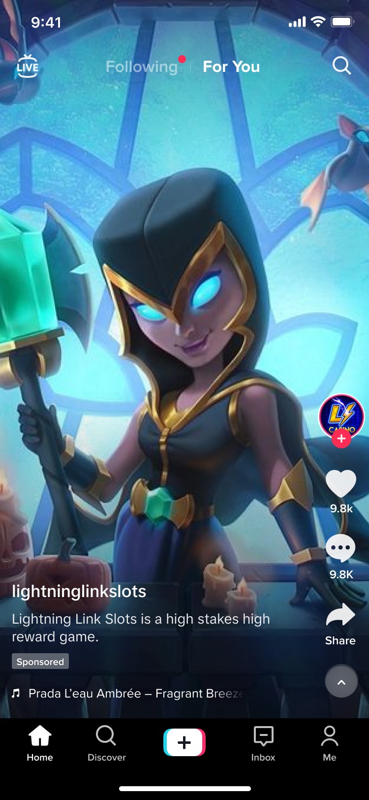
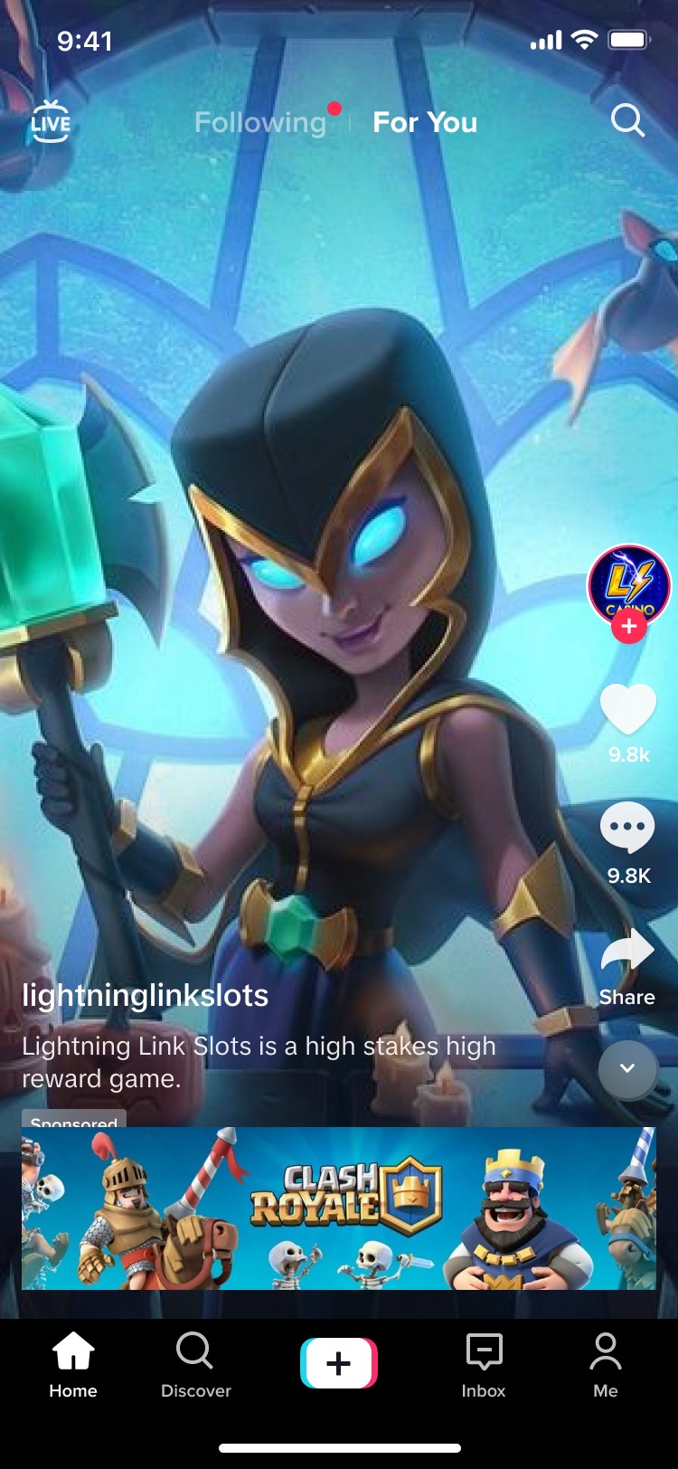
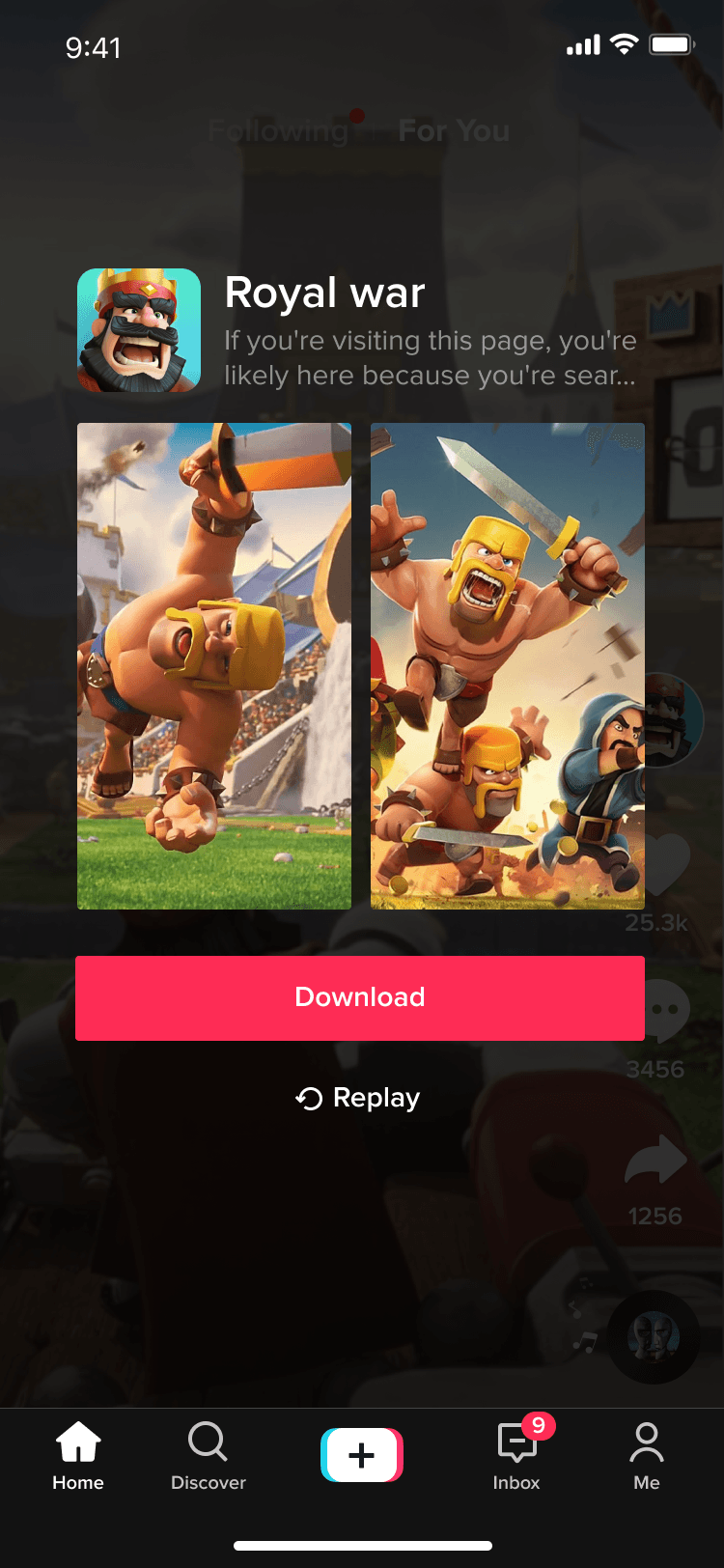
Basic CTA
The most common type of ad on Tiktok. In-feed ads can be used to promote products, offers, drive traffic to a website or raise awareness.
Highly flexible and simple to set up, these ads support any objective, from direct e-commerce sales to mass awareness.

Measuring Results
Optimized & standardized button colors from test cases & ensured proper WCAG standards for legibility. Additionally, reduced display timing from 3000ms to 2000ms to correspond with fall off rates, driving a .39% ($300k/daily) improvement in click through rate.
CTR +.39%
+
CVR +.106
+
Single product item
Single Product format features the ability for the advertiser to be able to promote a single product, app or service.
• You would like to feature one item you would like to highlight
• You would like to offer additional product information such as name, price or make
• You want to drive people to make a purchase
• Would like the ability to link to a PLP or PDP through a CTA

Measuring Results
During our testing of various solutions for the single product ad, this version illustrated resulted in the highest conversion rates.
CTR +3.43%
+
CVR +1.5%
+
Multi-product showcase
The multi-product showcase format features the ability for the advertiser to be able to promote a multiple products with descriptive text.
• You have a catalog of less than 5 or more than 5
• You would like to offer additional product information such as name, price and more
• You have one product you would like to highlight followed by additional products
• You want to drive people to make a purchase
• Would like the ability to link to a PLP through a CTA


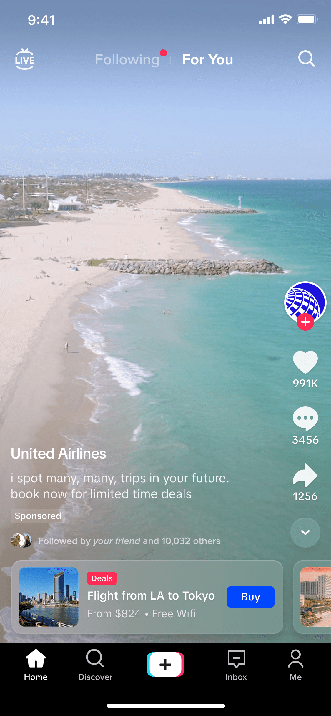
Measuring Results
By introducing a peak into additional product thumbnails as well as reduced real estate for the advertisement resulted in a positive impact when compared to the previous format.
CTR +5.3%
+
CVR +2.5%
+
Collection thumbnail showcase
The collection thumbnail showcase ad format is available for e-commerce use cases. This format allows advertisers to showcase several different thumbnails that would then link to a PDP
• You have a catalog of 5 or more products
• You want to display multiple products in a row so people can browse and quickly see your inventory
• You want to drive people to make a purchase
• Would like the ability to link to a PDP through a CTA
Measuring Results
The thumbnail collection is a new format that previously did not exist. However, providing advertisers the ability to offer two different formats for their needs resulted in delight from the advertisers to be able to offer additional flexibility
CTR +3.3%
+
CVR + 1.2%
+
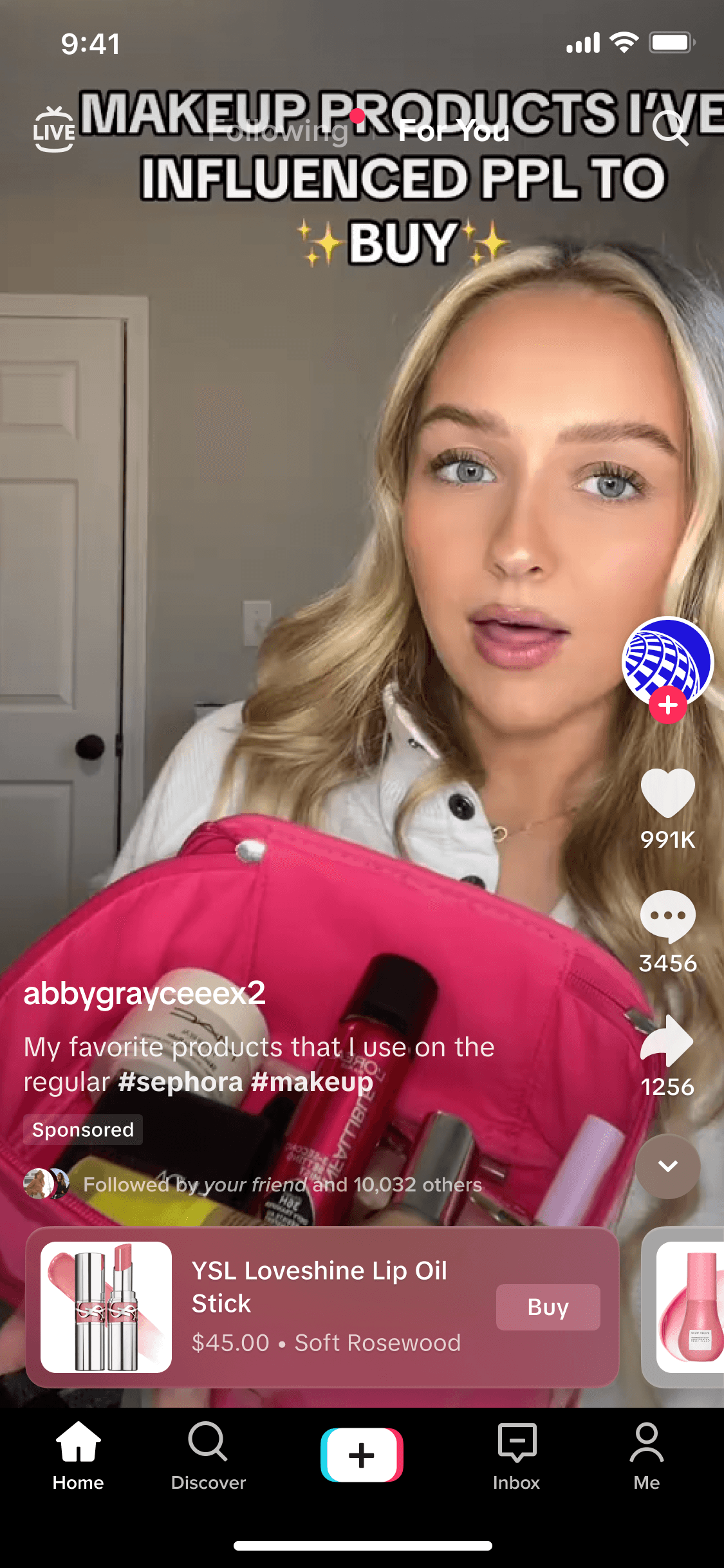
Display cards
Display Card is an interactive add-on product that lets you include cards within your in-feed video ads. You can use these cards to highlight important messages, share exclusive offers, and drive traffic to your website or app.
• You would like to feature one item you would like to highlight
• You would like to offer additional product information such as name, price or make
• You want to drive people to make a purchase
• Would like the ability to link to a PLP or PDP through a CTA
Measuring Results
While the display ad didn't go through major changes, I gave the users the ability to minimize the display ad and then having the flexibility to open it back up. The resulted in lower click through rate from what existed. This is contributed to research on heat maps that led to the conclusion that there are many accidental clicks on the ad when users are trying to close it. By alleviating this, it results in a lower ctr but a higher CVR and a better UX
CTR - 1.2%
-
CVR +.86%
+
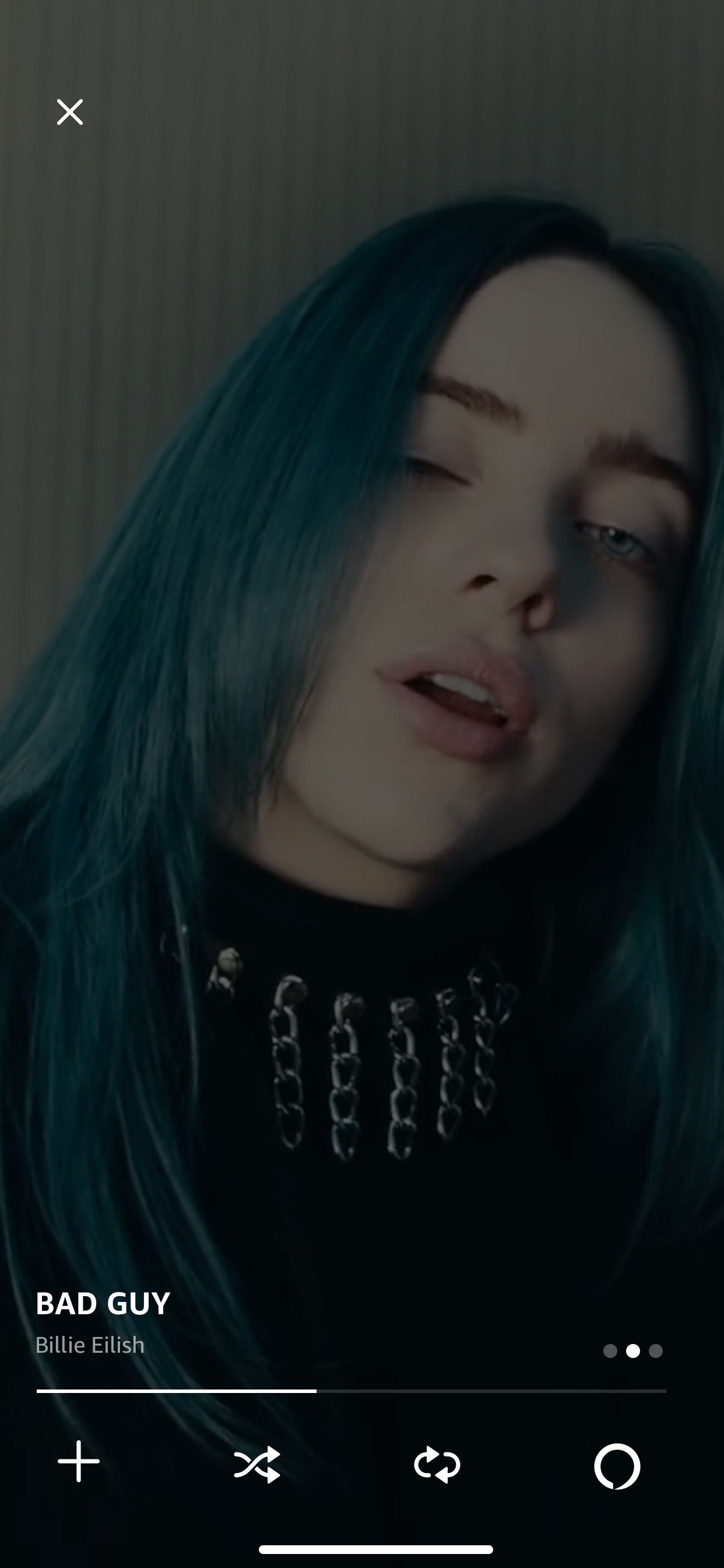
End cards

Measuring Results
The redesigned endcards feature new animation capabilities including choreographed UI elements, ambient animations and an overall less jarring experience.
CTR + 3.3%
+
CVR +4.5%
+
Carousel end card
Measuring Results
The carousel endcard format was designed in a way to be able to support various aspect ratios of images/video from the app's app store experience. Additionally, a carousel was introduced to be able to scale between various numbers of images.
CTR + 4.24%
+
CVR +5.2%
+
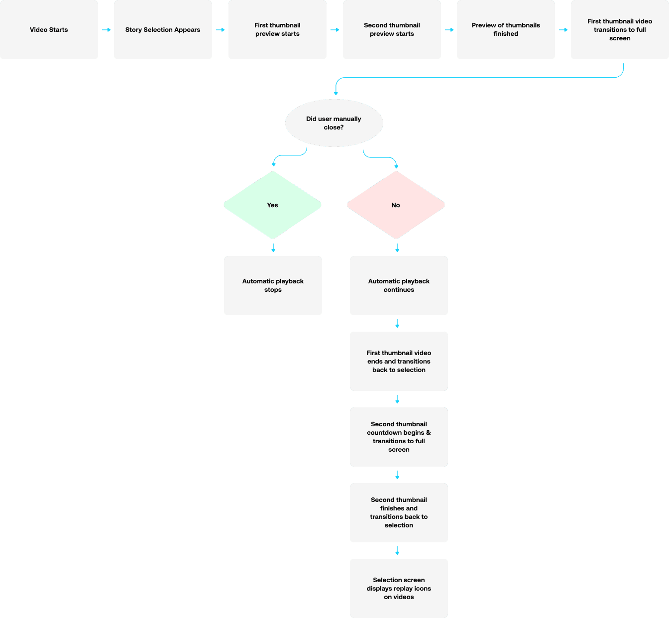
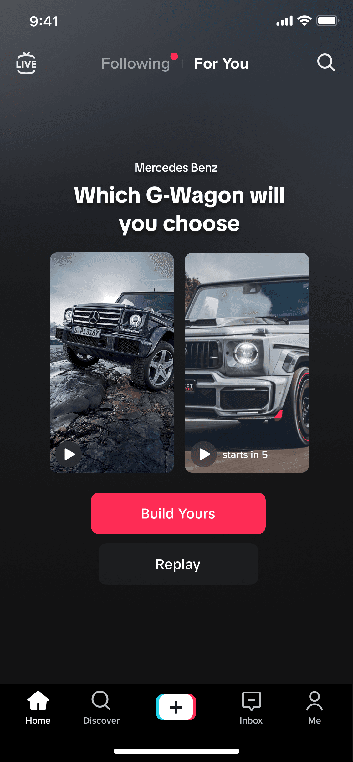
Story selection

Use Cases
Entertainment
Enrich the user experience by allowing the audience to bring themselves into the plot with two different choices for episode outcomes or characters for the announcement of a new product, movie launch, movie, festivals, etc.
Gaming Industry
Enrich the game experience by allowing the audience to bring themselves into the game scenario with two different game characters or scenarios for the announcement of a new product, game launch, new characters, functions, etc.
Ecommerce
Increase audience interaction and understanding of products by allowing the audience to click and select different product or SKU images to learn more about the product or compare them with two different videos to introduce newly launched products or announce in-event sales promotions.
Core flow
Designed to scale

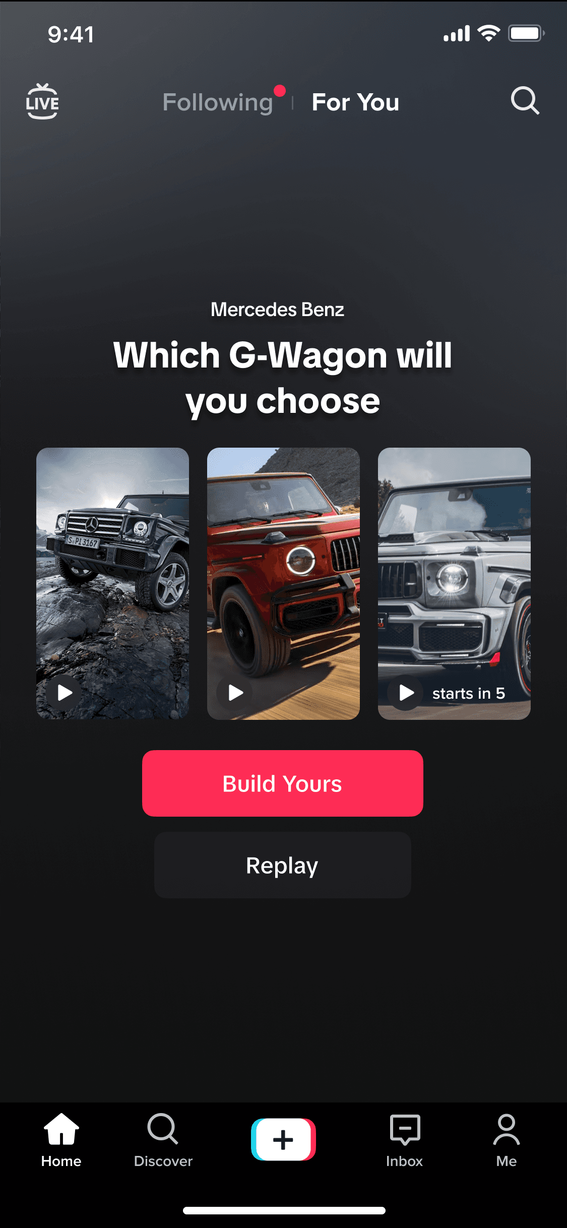
Final product
Working at within TikTok's design environment presented unique challenges in the intersection of eastern and western design philosophies. The company's native framework, Lynx was a work in progress. Lynx was built for rapid deployment and efficiency. This required me to advocate for how design improves the UX, aligns with business goals and drives innovation in order to have technical support to improve styling properties. The company knew that it needed to appeal to US markets. So, I realized that in order to do this, this required the following:
• Reinforce design recommendations with insights from research, how design backs business goals, drives innovation and education on products that appeal to this culture
• Releasing the reins in ownership of visual styling and let it become others ideas. Only to plant seeds during CN reviews and let that inspire CN designers to make it their own.
• Balancing where we want to get to from a functional stand point and how our releases would improve over time as I achieved buy in to get support to build in additional technical capabilities
This required me to become versed with many eastern products and learning about areas such as urban environment influence, super-app ecosystems and information dense products. While these can be quite overwhelming to other parts of the country, these patterns felt natural to eastern cultures.
As the first US hire in monetization & generative AI, I quickly found that to be able to communicate effectively while at Tiktok, it wasn't about having water cooler conversations or intrapersonal conversations where we could discuss concepts and ideas and freely discuss. Majority of all conversations required some type of translation services - which weren't always accurate. What I learned that really helped me was to be more of a visual communication bridge that could effectively communicate design intent across cultural and language barriers, such as using prototypes and flows to illustrate complex interactions or new ideas. This allowed me to build consensus through visual ways rather than abstract discussion.